Service Blueprints
Part of Customer experience for digital services
Testing help content at the point of confusion
Find where customers need help, test an explanation in the task and check whether it improves correct completion.
Test help where a customer needs it: beside the question, error or decision that has stopped their progress. The test is whether they understand the next action and complete it correctly, not merely whether they open a help panel.
Locate the question the customer cannot answer
Observe a task before writing more instructions. Note the step, what the customer tried, the words they used and whether they looked for help. An unfamiliar label, a missing eligibility rule and a failed upload call for different responses. Check whether the service already has the information it asks the customer to supply.
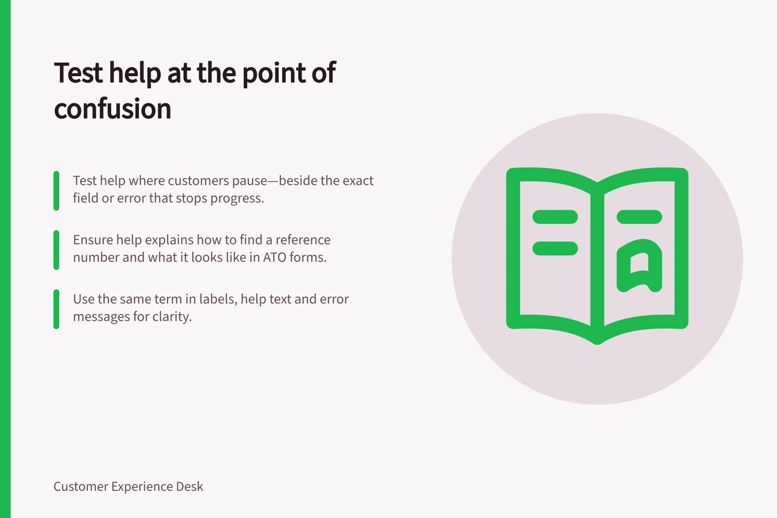
Suppose a form asks for a “reference number” and customers cannot tell which number it means. A candidate explanation could say where to find it and how to recognise it. If customers have no access to the number, help text alone will not make the task possible; the service needs another route.
Put the smallest useful answer in context
Place the explanation before the customer must act, close to the relevant field or choice. State a required format where it matters and use the same term in the label, help and error message. When a submission fails, identify the input needing attention and explain how to correct it. Give a clear overall result so the customer knows whether the submission succeeded.
Keep a longer article for information people need before starting or for questions that cannot fit beside one step. Do not make customers leave a transaction to find a short definition they need there. Check that help can be found and understood with a keyboard and assistive technology, rather than relying on a hover-only icon.
Run a task-based comparison
Give participants a neutral goal and let them reach the confusing step as they normally would. Record whether they notice the help, what they think it means, whether they enter the right information and whether they finish unaided. Test a revised version under comparable conditions. If a moderator has to explain the field, record that intervention separately from unaided completion.
Ask a brief follow-up after the task, such as “What did you understand this field to mean?” Judge the wording by what people can do with it as well as what they say about it. Review errors and support contacts after a live change if those records are available, while recognising that other changes may also affect the numbers.
If people read the revised help but still make the mistake, investigate the question, input design or rule. If the help is accurate but unseen, reconsider its placement and presentation. Record which version was tested, with whom and for which task so the finding’s limits remain clear.